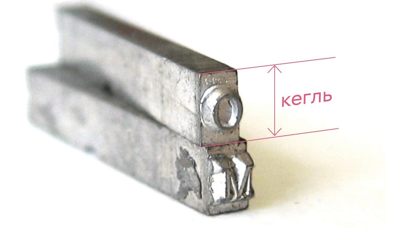
"Kegel" (from German Kegel) is the vertical size of a typeface, encompassing the top and bottom edge of a printed letter along with its ascenders and descenders. The novel mentions a "standard kegel" — a term well known to anyone connected to publishing in the 1990s.
The system of measurement
Kegel is measured in typographic points (denoted "pt"). In Russia and Europe, the traditional system was the Didot system, created in Paris in 1785, where one point equals about 0.376 mm. In the Anglo-American system, a point was 0.353 mm.
In the era of metal typesetting, kegel was defined by the physical size of the printing sort — from the top to the bottom of the line. With computer typesetting, which was actively being adopted by Russian print shops in the mid-1990s, kegel came to mean the size of the em-square in which a character is set.
Traditional names for type sizes
Russian typesetters developed a rich tradition of naming different type sizes. Each size had its own name:
- Brilliant (3 pt) — the smallest type size
- Diamant (4 pt) — a very small typeface
- Pearl (5 pt) — a small typeface for footnotes
- Nonpareil (6 pt) — popular for reference works
- Minion (7 pt) — often used in dictionaries
- Petit (8 pt) — a small body-text typeface
- Bourgeois (9 pt) — an intermediate size
- Long Primer / Corpus (10 pt) — the main body-text size
- Pica (12 pt) — a larger body-text typeface
- English (14 pt) — used for headings and emphasis
- Great Primer (16 pt) — a large heading typeface
The "standard kegel" in business documents
The "standard kegel" mentioned in the text most likely refers to Corpus (10 pt) or Pica (12 pt). These sizes were the most common for setting body text in business documents, contracts, and official papers in the 1990s.
Corpus (10 pt) was considered optimal for long texts — offering good readability without taking up too much space on the page. Pica (12 pt) was used when extra readability was needed, or when a document was intended for readers with poor eyesight.
The printing trade in the 1990s
In the mid-1990s, Russian print production was going through radical change. Alongside traditional metal-type and photo-typesetting technologies, computer publishing systems were being actively adopted. Many print shops still worked the old way, with metal type, where the concept of kegel had a literal physical meaning.
Professional typesetters and proofreaders of the era used the traditional type-size names fluently. It was part of the professional jargon, understood by everyone connected to publishing — from print-shop workers to newspaper and magazine editors.
Practical application
In business documents like the contracts mentioned in the text, using a "standard kegel" was no accident. Font size shaped how a document was perceived: text too small could look like an attempt to hide important information, while text too large could seem disrespectful to the reader or an attempt to artificially inflate a document's length.
Choosing Corpus or Pica for a contract's main text signaled the drafters' seriousness and respect for their readers, ensuring important information — like dividend payments and other key terms — was easy to take in.